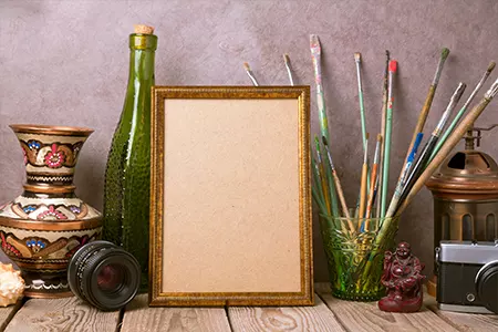
Embedding text with visuals is a tricky balance. The image and text must achieve visual harmony to provide professional, captivating content.
Here are five tried-and-true tips for overlaying text on imagery.
Be Cautious About Brightness, Contrast, And Colour:

Your content will stand out and be easier to read if the text and image have a significant contrast.
One of the most popular techniques is to use lighter text over a darker picture, or vice versa. Making your text stand out and adding more colour to your design will be accomplished by using complementary hues, such as orange and blue.
Evaluate Your Text:

While large, bold writing will grab readers’ attention, occasionally a subtle, tiny font can have a greater effect.
A softer, more delicate font may provide a great contrast to a strong, powerful image. Thinner text may be just as attention-grabbing as bigger lettering.
Blurry Pictures:

To calm down a cluttered image, consider adding a blurring technique.
The picture shifts from being the main focus to becoming a component that may improve and add to the mood of the entire design. Additionally, it offers a blank canvas on which to write the words.
Frame Your Text:

A frame around the text aids in establishing a distinct focal point. If the backdrop of the frame is coloured, consider adding some transparency.
By doing so, you may view the backdrop image through the frame and complete the picture.
Use an Image’s Perspective:

To give the impression that the words are stretching into the space, align your text’s viewpoint with the visual. The text will appear to be foreshortened by adjusting the font size and angle.


Leave A Reply